Developing intuitive, accessible experiences for capitalone.com
How can we help customers easily discover new card and bank products?
role
front-end developer
team
3+ engineers, designer, product manager, data analyst
tools
Angular
HTML / CSS
Github
Figma
skills
web accessibility
web development
A/B testing

context
With Capital One's primary focus on digital banking, capitalone.com is the doorway to all its banking products and services. The team I'm on focuses on improving Capital One's Homepage and Search experiences which serve more than 100M customers. Our goal is to help customers discover and answer questions for relevant products. I focus on developing experiences that meet the needs of all customers. To do this, I changed my team's development process to promote collaboration between engineers, designers, and the accessibility team.
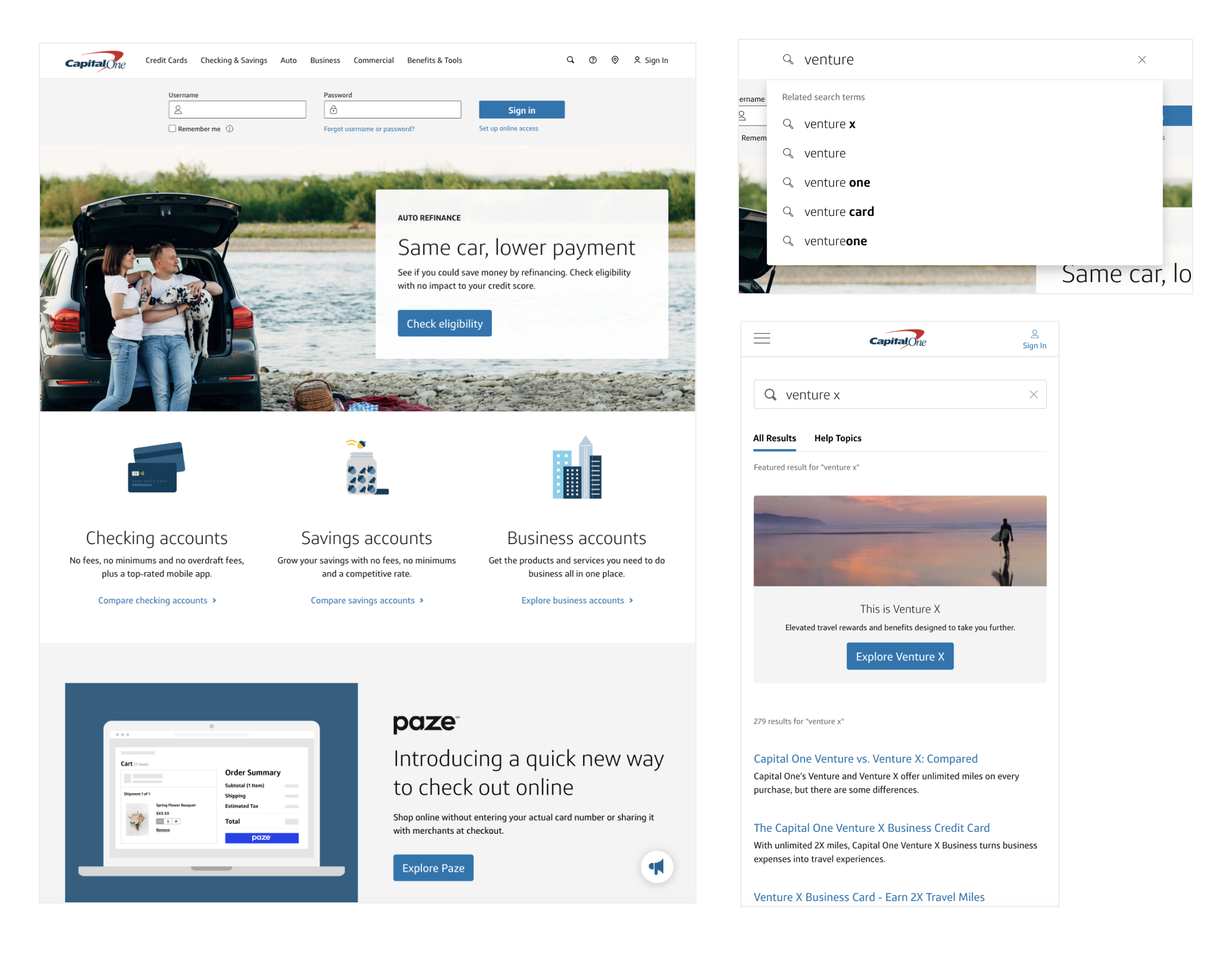
This section is password protected because I'm unable to publicly share more details about this project. To read on, enter the password or shoot me a message!
problem
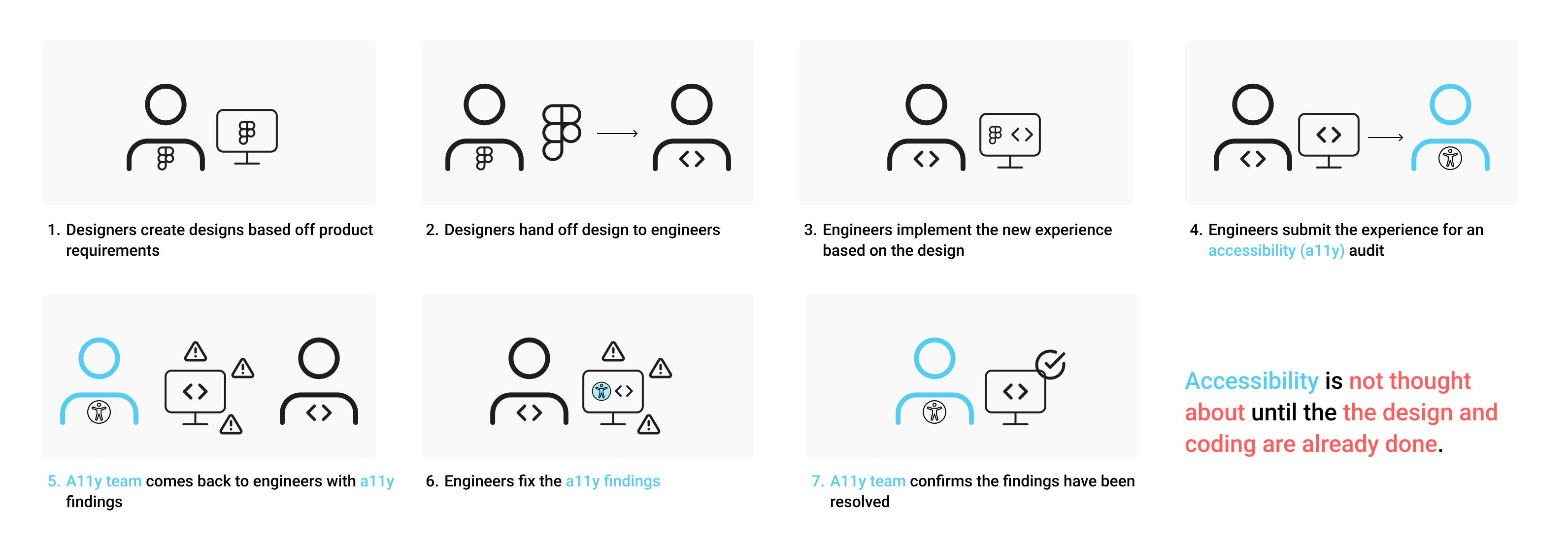
As I started developing new experiences for capitalone.com, I noticed that accessibility was not considered until the very end of development. Early on in the team, accessibility reviews were submitted as a very last step of the development process, which often led to parts of code needing to be rewritten or even designs needing to be updated to satisfy the accessibility requirements.
solution
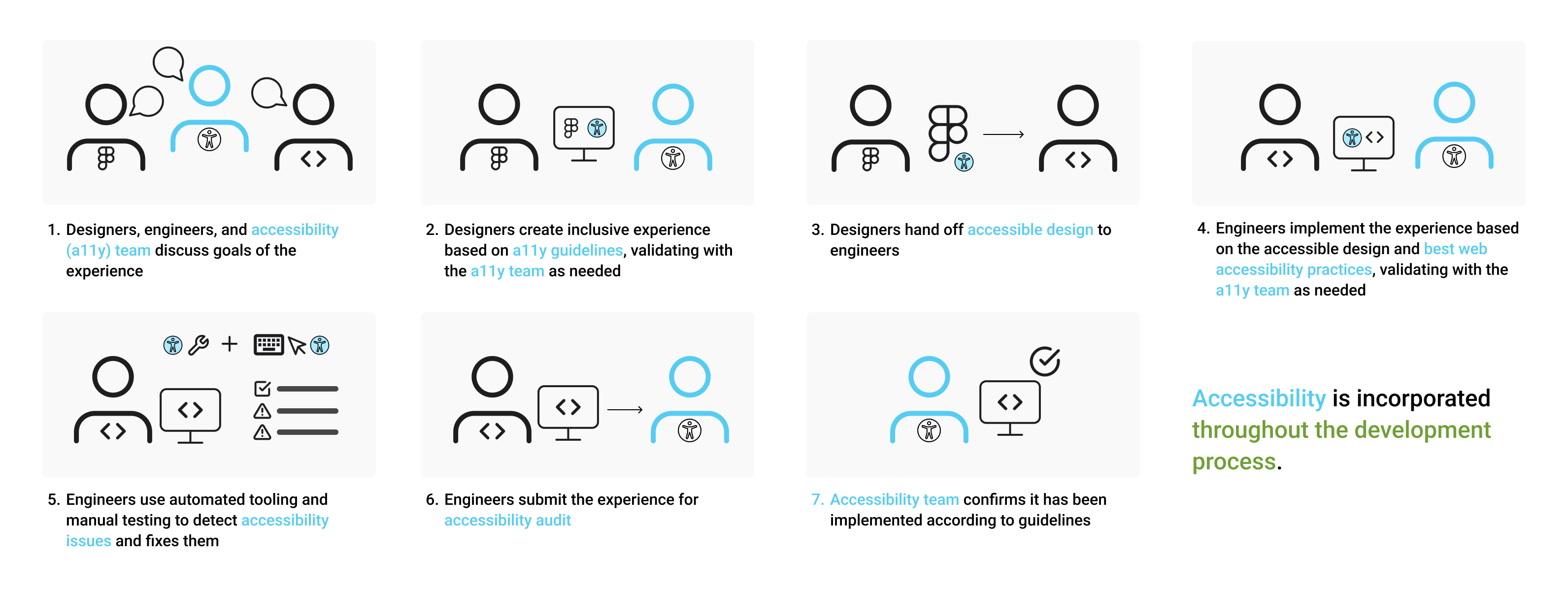
Seeing this gap in our development process, I wanted to make accessibility an intentional process right from the start instead of an afterthought that was just there to satisfy legal requirements. I started advocating for both engineering and design teams to work with the accessibility teams during the early planning phases of the development process. I emphasized that collaborative planning of how this experience will function reduces churn later in the development process and emphasizes a human-centered mindset among the team. I also evangelized the importance of doing manual accessibility testing on top of automated accessibility testing since not all accessibility requirements can be caught with automation.
With that, this was the new process I proposed and brought forth to my team:
helping customers find answers with Search
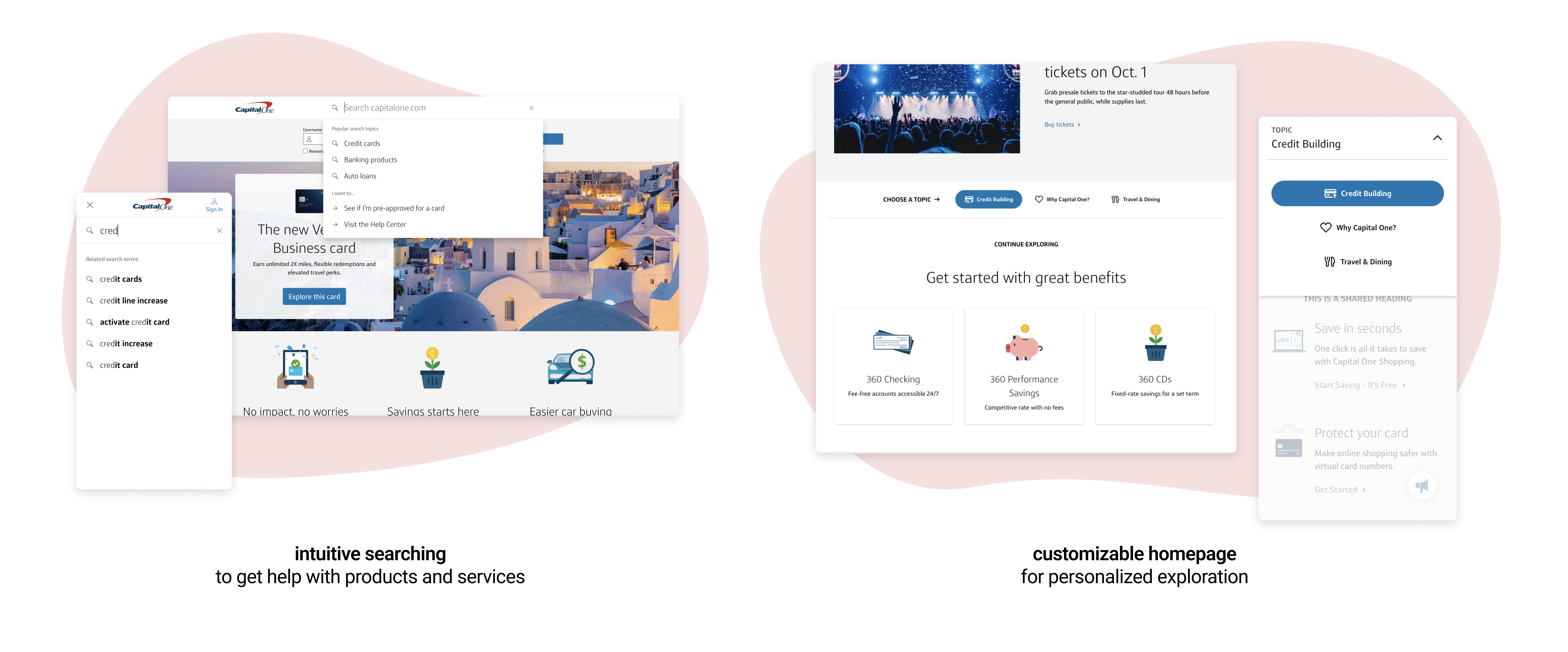
Two projects come to mind when I think about how we put these new accessibility practices into action. The first was the Capital One Search dropdown, which was a new feature we built from the ground up with a deeper focus on how users with disabilities would be able to match their search intent to a search result.
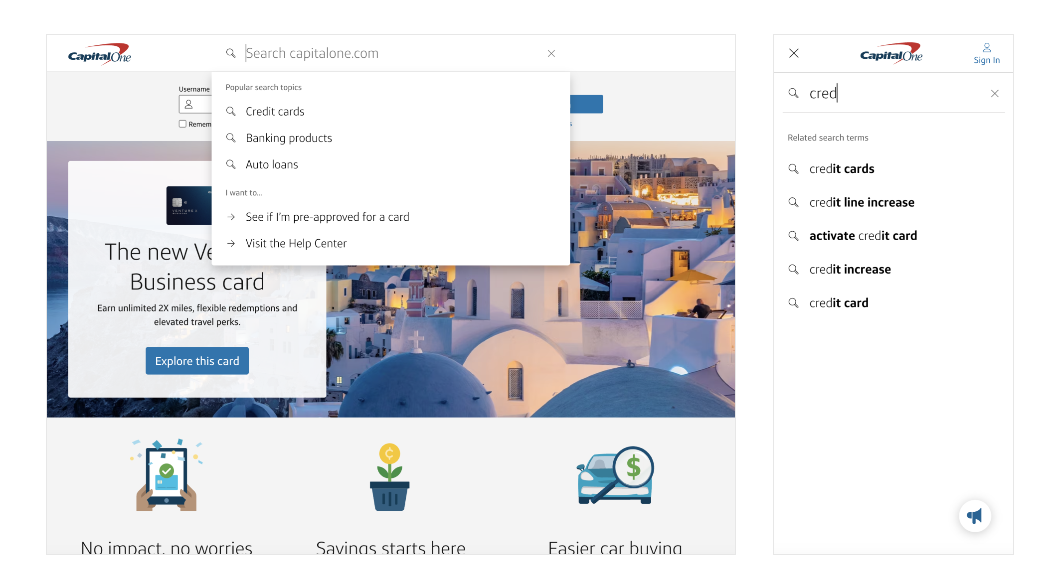
When I first received the designs, I realized that keyboard interactions were completely unaccounted for. Not only are keyboard interactions a common way for users to navigate in a dropdown, but they are also a vital element of meeting accessibility needs across all users.
How can we ensure keyboard users can easily navigate the Search dropdown?
I balanced requirements for the dropdown to be both elegantly designed and semantically understandable to those who may be visually impaired. After a few live code workshopping sessions with the accessibility and design teams, we arrived at a search dropdown that was accessible and easy to use.
- Users can navigate with keyboard
UpandDownarrow keys through the search options - Users can
Tabthrough search options with a focus highlight state - Underlines indicate the active option
- Addition of proper
aria-labelsandrolesso that assistive technology can read out the proper options and functions - Researched design patterns across other search engines to follow keyboard patterns familiar to users
Through this work and other enhancements to surface featured results on the search page itself, we increased the likelihood of users making a high quality search that drove them to their intended destination. We saw a +7.1% increase in first page click-through rates and a baseline 41.2% click-through rate on the newly developed dynamic dropdown. This was a big milestone in part of our efforts to capture user intent and provide them with relevant information and guidance.
driving customer discovery on the Homepage
The second case that exemplified strong accessibility practices was the capitalone.com Homepage customization feature. Specifically, we wanted customers to be able to change the Homepage to match their specific intent by clicking on different tabs, swapping out the content underneath. Planning with design and accessibility partners was crucial to set us up for smooth development.
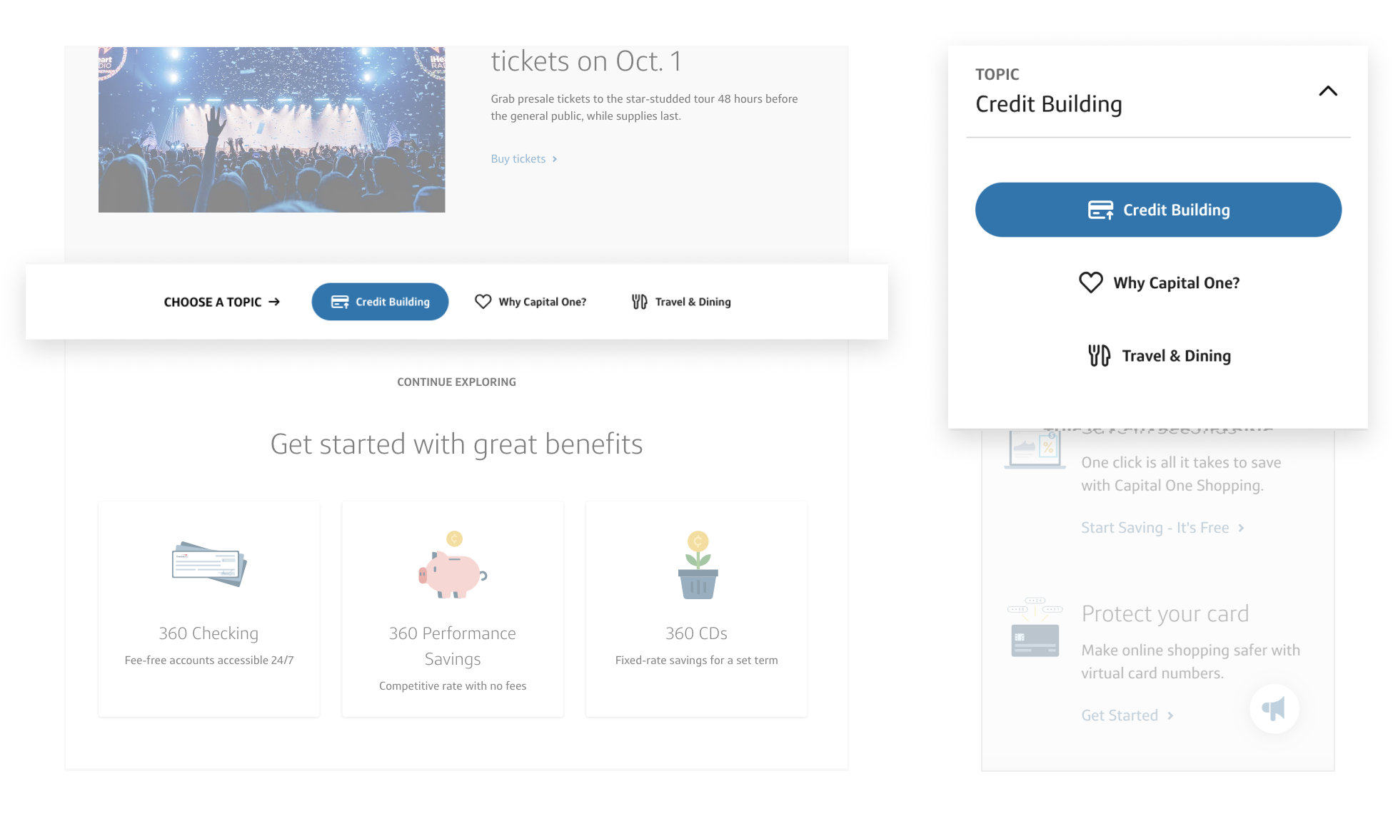
As this component design was new to Capital One, it wasn't clear what kind of component architecture would make the most sense for users. Should the buttons act like links that link to subpages? Should it act like a filter? What kind of semantic HTML should we use?
How can we ensure all users understand how to use this complex component on mobile and desktop devices?
While planning out how we were going to implement this new component, I pulled in design and accessibility partners to discuss the intention of this component and the most semantically logical HTML.
Since this component is meant to segment out different customers (e.g. people seeking to build credit, frequent travelers) and products (e.g. credit cards vs banking accounts), our accessibility partner suggested a tab panel implementation for desktop. On mobile, we would leverage a dropdown navigational menu, with the menu appearing as an overlay.
When it came to development time, my teammate and I kept in constant communication with our accessibility partner to ensure our approach was in line with what we had discussed. We also asked questions as they came up around keyboard interactions and HTML structure.
Ultimately, we started as early as possible in the process to understand the accessibility requirements and were able to save a lot of code rework. If we had not aligned with our accessibility partners from the get-go, we may have had to redo the code structure and caused additional churn. Instead, we swiftly introduced a more accessible, customizable homepage experience for all types of users.
impact
With this more collaborative and streamlined workflow, our team is much more productive. Capital One's site a11y standards also go far beyond what's legally required of it, as we put inclusive experiences first and foremost in the development process. With my learnings about human-centered development, I wrote an internal blog about how engineers can adopt human-centered design and development in their day-to-day work. Today, I continue to advocate for human-centered thinking and cross-pollination to bridge the gap between engineers, designers, accessibility teams, and product managers.
